3 T-Tests: Theory, Visualisation, and Calculation (by hand)
As mentioned in the previous chapter, t-tests help us answer key questions such as whether a new treatment is more effective than an existing one or if two groups differ significantly on a psychological measure. The theory behind t-tests is rooted in hypothesis testing, specifically Null Hypothesis Significance Testing (NHST), which helps us determine whether observed differences in data are likely due to chance or reflect true differences in the population.
When comparing groups, our goal is to determine whether the differences we observe are statistically significant—that is, whether they are unlikely to have occurred by chance. T-tests allow us to test hypotheses about differences between group means, providing a way to infer from sample data about the larger population. In essence, when we conduct a t-test, we are assessing whether the difference in means between two groups is large enough to be considered meaningful given the variability in the data.
There are two main types of t-tests that are commonly used in research, each suited to different study designs:
Independent Samples (between-subjects) T-Test:
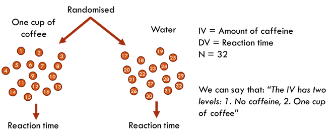
This test compares the means of two independent groups to determine if there is a statistically significant difference between them. It is used when the groups are distinct and not related.
For example, a researcher could compare the average reaction times of two different groups of participants, one receiving caffeine and the other receiving water.
Paired Samples (within-subjects / repeated measures) T-Test:
This test compares the means of two related groups, such as the same participants tested under two different conditions (e.g., before and after an intervention). The paired samples t-test is often used when the same subjects are measured more than once, or when pairs of subjects are matched in some way.
The same experiment from the above independent samples design could be redesigned as a paired samples design. Meaning that each participant takes part in each condition of the experiment.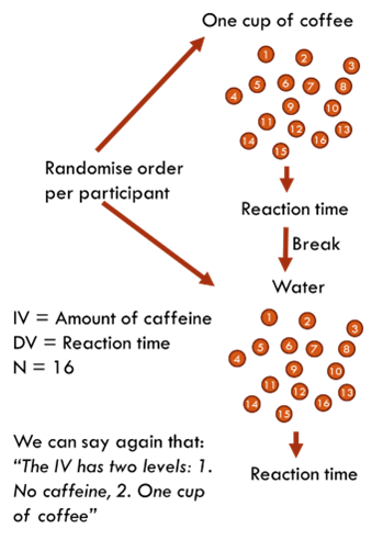
When designing an experiment, you will likely be choosing between an independent measures design (between-subjects) and a repeated measures design (within-subjects) for each of your IVs. Each choice has distinct advantages and disadvantages that can influence the study's feasibility and data quality. See the blue box below for more detail on these advantages and disadvantages.
In an independent measures design (between-subjects), each participant is assigned to only one condition, which avoids the risk of order effects such as practice, fatigue, or carryover effects that can confound the results. This design is simpler to analyse since each participant provides only one data point, making the setup straightforward. Additionally, because participants are exposed to only one condition, there is less risk of participant fatigue or boredom affecting the data. However, independent measures design typically requires a larger sample size, which increases the cost and time needed for recruitment and testing. There is also greater between-group variability since different participants are in each group, which can introduce differences that are unrelated to the independent variable and may complicate the interpretation of results.
In a repeated measures design (within-subjects), the same participants are used across all conditions, which significantly reduces the number of participants needed and, therefore, the overall cost and time required for the study. This design also reduces variability due to individual differences, as each participant serves as their own control, leading to increased statistical power. However, repeated measures designs are prone to order effects, which can confound the results. To mitigate these issues, researchers often need to use counterbalancing, which adds complexity to the design and analysis. Additionally, participants may become fatigued or lose focus when completing multiple conditions, which can affect their performance and potentially skew the results.
The following video is an extract from one of my lectures where I explain the design aspects of t-tests:
3.1 What does statistical difference look like?
Before diving into the mechanics of t-tests, it's important to understand what statistical difference looks like. Even when two groups have different mean values, this difference might not be meaningful unless it exceeds what could be expected by chance. This is where inferential statistics come in, allowing us to determine whether the difference observed in our sample data reflects a true difference in the population.
Here is an example of reaction time (in milliseconds) data from a N=8 independent samples design of the IV=coffee/water DV=reaction time study from above.
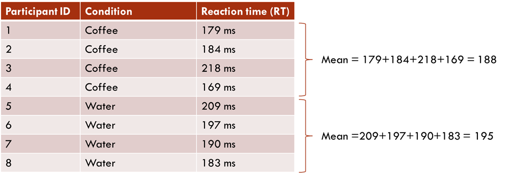
From this data we can say that, on average, the reaction time in the coffee condition is 7.25ms faster than for those participants in the water condition.
Well, we could plot the data and see how it looks. Here is the data as a line graph:
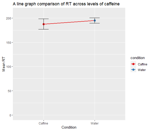
The points represent the mean reaction time for each condition, with the vertical lines indicating the 95% confidence intervals (CIs) around these means. The CIs provide a range where the true mean RT is likely to fall with 95% confidence, based on the mean and the variability within the data. It’s a great concept to use to help determine significance within your data. In this case, the overlap of the CIs suggests that the difference in mean RT between the Caffeine and Water conditions might be small and potentially not statistically significant, although a formal statistical test would be needed to confirm this.
So, to me, just by looking at the data in this way, I’m not overly convinced. Especially due to the sample size of N=8 (four in each condition). This aspect will likely mean that the study has a particularly low statistical power, a concept that we will cover in more depth later in this handbook.
Say instead, we run the study on N=100 participants.
Another way to visualise our data is by looking at our distribution rather than just the mean and 95% CI. The following histograms are based on running the experiment 100 times, with 50 participants in each condition.
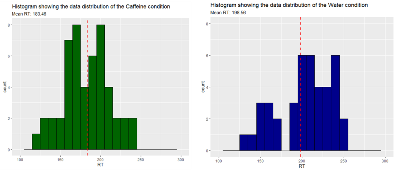
In the histograms shown above, each bar represents a "bin" that covers a range of reaction times (RT) within a 10-unit interval. The height of each bar corresponds to the number of data points (or "count") that fall within that range. For example, in the histogram for the Caffeine condition, the bar at 200 on the x-axis indicates that eight participants had reaction times between 200 and 210 milliseconds. In the water condition, no participants had a reaction time between 170 to 180 milliseconds.
The red dashed line in each histogram marks the mean reaction time for that condition. By looking at the distribution of bars around this line, you can get a sense of how the data is spread out (as we previously did with the 95% CI).
From this example we can see a difference in the mean RT once again. The caffeine condition participants are, on average, 15.1ms faster than participants in the water conditions.
If we add a smooth line to the histograms and overlap them, this difference becomes more apparent. When the bars are removed this type of data visualisation is known as a density plot.
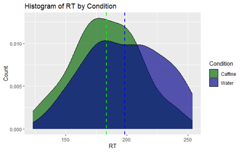
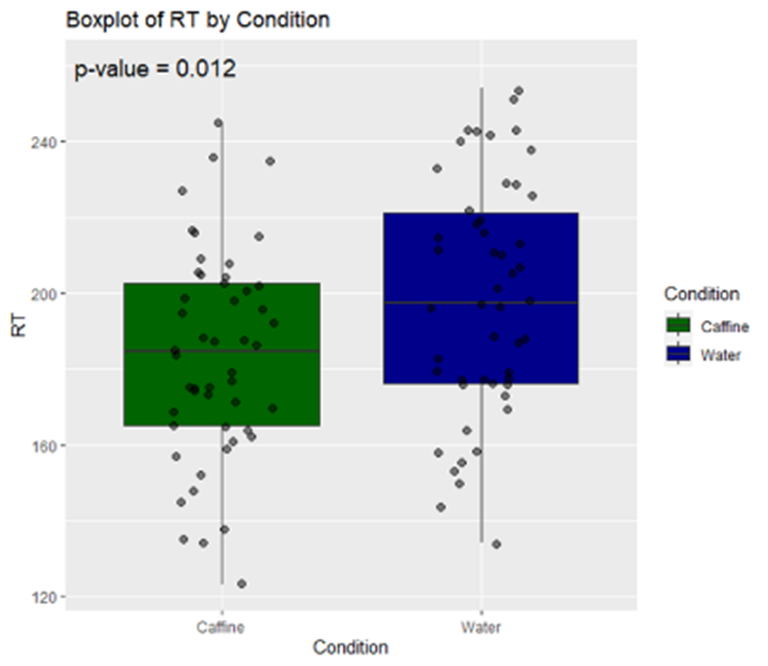
From this density plot we can see the distribution of data in the caffeine condition is shifted to the left of the water condition. You won’t see this type of visualisation in papers as it limits you to the comparison of two conditions (it gets very confusing with three or more overlapping colours). However, you might see these in combination with a box plot. Here is how I would choose to best visually represent this data:
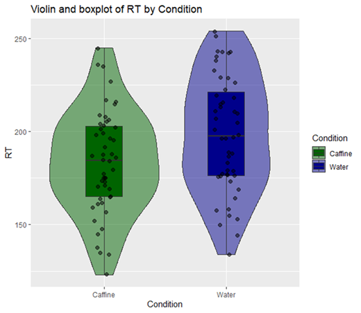
A box plot summarises the distribution, central tendency, and variability of data. The box itself represents the interquartile range (IQR), which contains the middle 50% of the data, with the line inside the box marking the median (note: not the mean). The whiskers extend from the box to the smallest and largest values that are not considered outliers, providing a clear view of the spread of the data. Outliers, or values that fall outside 1.5 times the IQR from the quartiles, are displayed as individual points beyond the whiskers (there are no outliers within this data but you might find them in yours, see assumption checks for more on this topic).
In this visualisation, the box plot is combined with a violin plot, which is essentially a mirrored density plot that shows the distribution of the data. The wider sections of the violin indicate areas where data points are more concentrated, while the narrower sections represent less frequent values. This additional layer helps you understand not just where the central values lie, but also how the data is distributed across the range of reaction times.
Finally, individual data points are plotted using a technique called jittering, which spreads the points horizontally to avoid overlap, making it easier to see the distribution of values. It’s important to note that jittering does not alter the actual values of the data points; it merely adjusts their horizontal position slightly for clarity. Together, the box plot, violin plot, and jittered points provide a comprehensive view of the differences in reaction times between the Caffeine and Water conditions.
Now that’s a good-looking graph! But we still don’t know if this difference is meaningful, and it’s not immediately noticeable from the image. As such, we should move on to conducting a statistical test.
3.1.1 Sidenote on assumption checks
Before running any statistical test, including a t-test, it is crucial to perform assumption checks. Statistical assumption checks are procedures that verify whether the data meet the specific requirements of the test you plan to use. For t-tests, these assumptions typically include the level of measurement, normality of the data, and homogeneity of variances. Ensuring that these assumptions are met is essential for the validity of the test results.
However, while these checks are fundamental, it can be more conceptually intuitive to first understand how the t-test works and what it aims to achieve. By grasping the basic mechanics of the t-test and its purpose in determining whether differences between groups are statistically significant, you will be better equipped to appreciate why these assumptions matter. After we walk through the process of conducting a t-test, we will then revisit these assumption checks in detail in the next chapter.
3.2 What actually is a t-test?
The t-test is a statistical method used to determine whether there is a significant difference between the means of two groups. It compares the observed difference between group means to the variation within each group, taking into account the sample sizes. The result of this comparison is the t-value, which tells us how likely it is that the observed difference could have occurred by chance.
Here is the formula used to determine the t-statistic (don’t worry it’s not as scary as it looks):
The formula for the t-statistic is:
The formula for the t-statistic is:
\[ t = \frac{(\bar{X}_1 - \bar{X}_2)}{\sqrt{\frac{(s_1^2)}{n_1} + \frac{(s_2^2)}{n_2}}} \]
Where:
-
\(\bar{X}_1\) = the sample mean of group 1
-
\(\bar{X}_2\) = the sample mean of group 2
-
\(s_1^2\) = the variance of group 1 (square of the standard deviation)
-
\(s_2^2\) = the variance of group 2
-
\(n_1\) = the sample size of group 1
- \(n_2\) = the sample size of group 2 .
As such, we actually have everything we need to work out the t-statistics from the basic group descriptives of our data:
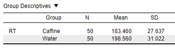
\[ t = \frac{183.460 - 198.560}{\sqrt{\frac{27.637^2}{50} + \frac{31.022^2}{50}}} \]
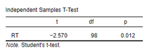
In this example our data gives us a t-statistic of 2.57.
After calculating the t-value, we need to determine whether this value is large enough to indicate a statistically significant difference. This is done by comparing the t-value to a critical value from what is known as the t-distribution. In this case, our critical value (which is based on the desired level of significance, commonly 0.05) and the degrees of freedom (which depend on the sample sizes) guide us to the number that our t-statistics needs to be higher than for the finding to be judged as significant. If the calculated t-value exceeds the critical value, we reject the null hypothesis and conclude that there is a statistically significant difference between the groups. (Note: this value will differ depending on if you have a one-tailed or two-tailed hypothesis)
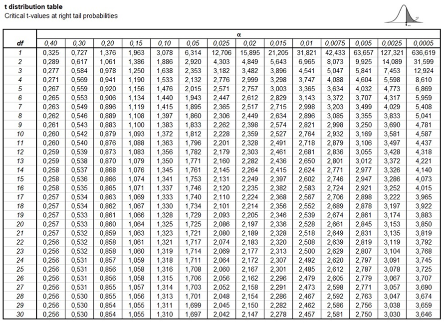
In our case, if we take our usual alpha value of 0.05, and find a t-distribution table that stretches to our degrees of freedom, which is df = (n1 – 1) + (n2 - 1) = 98
The distribution says we need to have a t-value of over around 1.98 for our finding to be significant to the 0.05 level and over 2.62 to be significant to the 0.01 level. So, with a t-value of 2.57, we’re a little over the 0.01 level. In fact, when we run this in JASP we see that our exact p-value for the comparison is 0.012.
That’s certainly a very nerdy question for you to ask, I will try my best to answer it!
The t-distribution itself is a probability distribution that is similar in shape to the normal distribution (bell curve), but it has heavier tails, meaning it is more spread out.
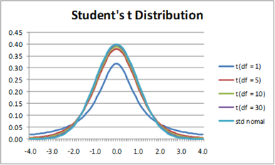
Each number in the t-distribution table corresponds to a specific critical value of the t-distribution for a given confidence level (like 95%) and degrees of freedom (df). Degrees of freedom are calculated as the total number of observations in both groups minus the number of groups.
When you look up a critical value in the table, you're finding the t-value that cuts off the most extreme 5% (for a 95% confidence level) of the t-distribution. If your calculated t-value exceeds this critical value, it falls within this extreme region, leading you to reject the null hypothesis.
Here is a good explainer video on the topic: link
3.3 Is all this maths stressing you out?
While understanding the formula is valuable, it is important to note that modern statistical software, such as JASP, can perform these calculations automatically. In practice, you will not need to manually compute the t-value; instead, you will simply input your data into JASP, and with a few clicks, the software will provide you with the t-value, degrees of freedom, and the corresponding p-value. This makes conducting t-tests accessible, even if the underlying mathematics may seem complex at first glance.
3.4 Writing up findings in APA style
Once we put our findings together, this is what we can reliably report (minus our assumption checks):
We conducted an independent samples t-test to compare mean reaction time across levels of caffeine. The results showed a statistically significant difference between the means of the two groups (t(98) = 2.57, p = 0.012). The mean reaction time for participants in the caffeine condition (Mean = 183.5, SD = 27.64) was significantly lower than the mean reaction time for participants in the water condition (Mean = 198.6, SD = 31.02), indicating a quicker reaction time.
And add a graph just to make it easier for participants to interpret:
In the next chapter we'll talk through the assumption checks for t-tests and why they are important.