14 Simple linear regression
14.1 Recap of correlation
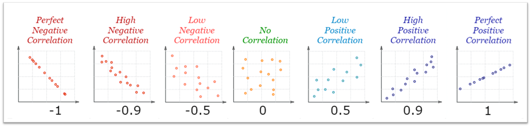
At its core, correlation provides a measure of how data points on two variables are related to one another.
- Positive Correlation: (top left figure) As one variable increases, the other also increases.
- Negative Correlation: (top right figure) As one variable increases, the other decreases.
- No Correlation: (bottom figure) There is no discernible pattern in the relationship between the two variables.
The strength and direction of the correlation are represented by the correlation coefficient, typically denoted as \(r\). The value of \(r\) ranges from -1 to +1.
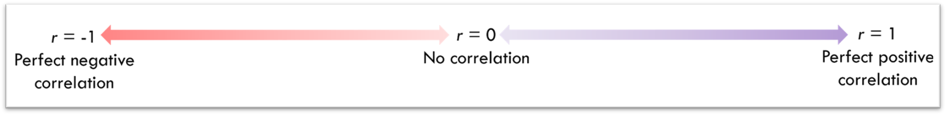
- An \(r\) value closer to +1 indicates a stronger positive correlation.
- An \(r\) value closer to -1 indicates a stronger negative correlation.
- An \(r\) value closer to 0 suggests little to no correlation.
14.1.1 Correlation as a Statistical Test
Going beyond visualisation of relationships, correlation can also be used as a formal statistical test to determine if there's a significant linear relationship between two variables.
When conducting a correlation test, the p-value informs us about the significance of our observed correlation coefficient (\(r\)). If the p-value is below a predetermined threshold (commonly 0.05), we infer that the correlation in our sample is likely not due to random chance, and thus, there's a statistically significant relationship between the two variables.
Surface Level Explanation:
A p-value is a number between 0 and 1 that tells us if the result of an experiment is likely due to chance or if there's something more going on. A small p-value (typically less than 0.05) suggests that the result is significant and not just a random occurrence.
Intermediate Explanation:
A p-value represents the probability of observing the data (or something more extreme) given that a specific null hypothesis is true. If we have a p-value less than a pre-decided threshold (like 0.05), we reject the null hypothesis in favour of the alternative hypothesis. This suggests that our observed data is unlikely under the assumption of the null hypothesis. However, a smaller p-value does not necessarily mean a result is "meaningful"; it just indicates it is statistically significant.
In-Depth Explanation:
Mathematically, the p-value is the probability of observing data as extreme as, or more extreme than, the observed data under the assumption that the null hypothesis is true. This is not a direct measure of the probability that either hypothesis is true. Instead, it's a measure of the extremity of the data relative to a specific model.
Lower p-values suggest that the observed data are less likely under the null hypothesis, leading us to reject then null in favour of alternative hypothesis. However, it's crucial to understand that a p-value doesn't measure the size of an effect or the practical significance of a result. Furthermore, while a threshold of 0.05 is common, it's arbitrary and must be chosen with context and caution.
Lastly, it's essential to remember the p-value is contingent on the correctness of the underlying statistical model and the level to which the data meet the statistical assumptions. Misunderstandings and misuse of p-values have led to various controversies in the scientific community (see the replication crisis). See Lakens (2022) Improving Your Statistical Inferences for a comprehensive overview of p-values.
14.1.2 Statistical assumptions of correlation
In frequentist statistical analysis, we often aim to use parametric tests when the statistical assumptions underlying these tests are met, as these tests can be more sensitive to smaller effect sizes. For correlation analysis, Pearson's correlation is the most commonly used parametric test and Spearman's Rank correlation is the most commonly used non-parametric test.
In my experience of teaching regression, the assumption checks are often the part of statistics that confuse students the most. For now, I've put them safely away in this box, so as not to scare you off in the first week :-)
We will do a fully refresh of the theory behind assumption check aspect next week when we cover multiple regression.
For correlation analyse the following assumptions should be checked and assessed:
Linearity: Both variables should have a linear relationship, which means that when you plot them on a scatterplot, the distribution of data points should roughly form a straight line.
Normality of Residuals: The data pairs should be normally distributed, meaning both variables being analysed should be approximately normally distributed when considered together. We do this by checking the normality of the residuals.
Homoscedasticity: The spread (variance) of the residuals are constant across all values of the variable on the x-axis. i.e. data points shouldn't start of clustered and the widen out (like a funnel) further along in the correlation.
Absence of Outliers: Outliers can disproportionately influence the correlation coefficient. So, it's important to check for and consider the impact of any outliers in the data. Outliers can be checked through the use of a boxplot or calculated manually.
14.2 Simple linear regression
The content in the sections above, likely reflects the extent to which you explored correlation in your first year here with us. Regression analysis is simply an extension of this knowledge. Central to this understanding is the concept of the "line of best fit".
While you might have previously used this line as a visual representation of the relationship between two variables, in linear regression, it takes on a more pivotal role.
14.2.1 The line of best fit
In the scatter plot below, you'll see data points representing the hours of sleep and test performance for various participants. Notice how the data points are positively correlated? We can capture this trend by drawing a straight line through the data. This line, which we call the "line of best fit," gives us a simplified representation of the relationship between hours of sleep and test performance. The optimal line of best fit is the one that minimises the total distance between itself and all the individual data points on the plot.
Even with the best possible straight line drawn through our data points, it's rare that the line will pass exactly through every point. The vertical distance between each data point and our line is called a "residual". For every data point, the residual is the difference between its actual value and what our line predicts the value should be. If our line of best fit is doing its job well, these residuals will be quite small, indicating that our predictions are close to the actual data. However, if the residuals are large, it suggests that our line might not be capturing the relationship between the two variables adequately.
We talk more about residuals, in the context of our assumption checks, in the next chapter.
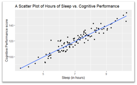
The purpose of the line of best fit is to model the relationship between test performance and number of hours slept.
What does this model suggest the performance on the test will be if a participant gets 7 hours sleep?
- Find the point for 7 hours on the x-axis.
- Draw your finger up to the blueline.
- Draw your finger across to the y-axis.
- Take that number.
That is the test score that our model suggest for a participant that has 7 hours of sleep.
14.2.2 The equation of a line
Every straight line on a scatter plot can be written as a simple formula:
\[ Y = mX + c \]
Where:
\(Y\) is the dependent variable.
\(X\) is the independent variable.
\(c\) is where the line intersects the Y-axis, representing the predicted test performance when no hours of sleep are had.
\(m\) is the slope of the line, indicating the predicted change in test performance for each additional hour of sleep.
To make the formula for our previous scatter plot all we need is to work out how much the blue line "goes up" by how far it "goes along", and where the line crosses our y-axis.
The below scatter plot is the same data but with each axes going to zero this time. This allows us to get our \(c\) value, 50, and by taking any two points on the line we can work out our \(m\) value, in this case 10 (60/6).
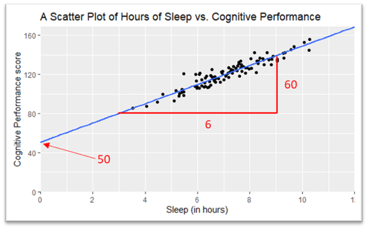
This gives us the following equation of our line:
\[ y = 10x + 50 \]
Look back at the question from before. All we need to do now is sub in the number 7 and we get our predicted test score: (10*7) + 50 = 120
14.2.3 Is this a good model?
This oft-cited quote sums up the a central truth in statistics and data modelling: no model can capture the full intricacy and unpredictability of real-world phenomena. However, that doesn't diminish the value of models. When a model simplifies complex systems and highlights important relationships, it can offer invaluable insights and guide decision-making.
The line on our sleep and test score scatter plot (above) would appear to be quite representative of our data and therefore is perhaps fairly a good model (so long as our sample is representative of the population we want to use or model on in the future).
However, if we try and use the relationship between participants height and their test scores as out model, this is likely to be a fairly poor model:
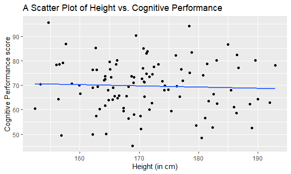
The model derived from this data, \(y = -0.05x + 77.89\), would actually give an answer close to 70 no matter an individuals height. In other words, whether you're taller or shorter, the model essentially shrugs and predicts something close to 70 (the mean of the dataset). I would not describe this as a very useful model, as in, I would not spend an evening on the rack to try and make myself taller for the test.
While we can see it on the scatter plot, none of the numbers in our equations allow us to gauge how 'useful' or fitting the sleep model is compared to the height model. To understand model fit we need the final new concept for this week, shared variance
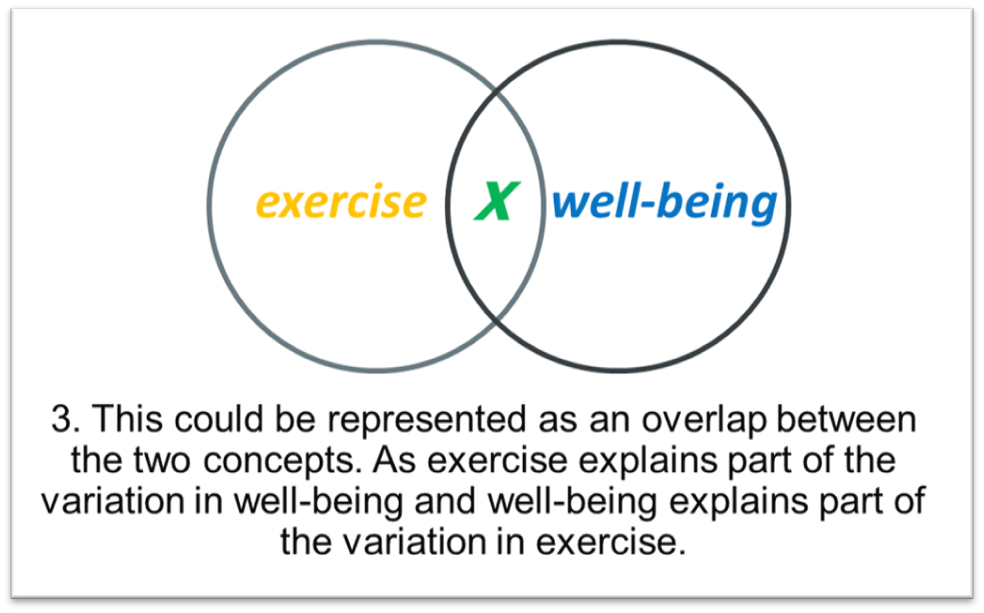
14.2.4 Shared Variance
When examining the relationship between two variables, the proportion of variation in one variable that can be predicted or explained by the other variable is known as the shared variance . In correlational research, this concept is crucial as it tells us how well one variable explains the variation in the other variable. In other word how useful would it be if we used a scores from one variable to predict scores on the other variable.
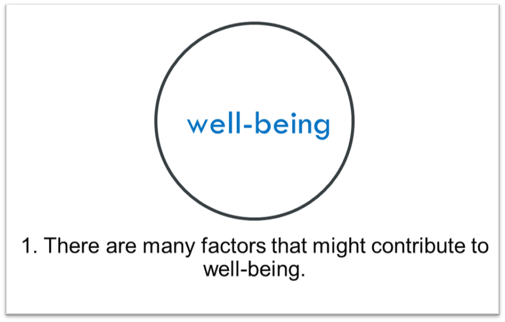
A good way to think about this visually is with a Venn diagram.
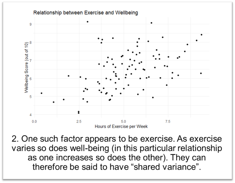
This value of shared variance is derived by taking the square of \(r\), the correlation coefficient, giving us our \(R^2\) value for the model. Take for instance, for our sleep model, if we run a pearsons correlation test on the data we find the relationship has a correlation coefficient of \(r\) = 0.94, squaring this give us a \(R^2\) of 0.89 between our predictor (study hours) and the outcome (test scores).
Another way to talk about \(R^2\) is to say that 89% of the variance in test scores can be predicted or explained by the number of hours studied. The remaining 11% of the variance is due to factors not included in our model or random error.
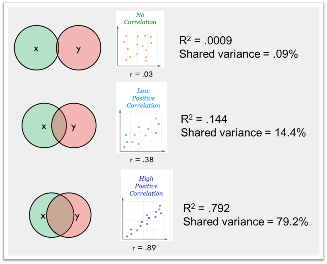
When we say two variables share a certain percentage of variance, it's a indication of the strength and utility of the relationship. However, while a high shared variance can be promising, it's essential to remember that correlation does not imply causation. Other underlying factors, third variables, or even coincidences could create correlations.
In practical terms, understanding shared variance is critical for researchers. When a significant shared variance exists, the predictor variable becomes valuable in understanding, predicting, or even potentially influencing the outcome variable. However, the unexplained variance might also prompt researchers to consider additional predictors or factors that weren't initially in the model.
Next week we'll start looking at multiple regression modelling, which as the name suggest involves multiple variables sharing variance with a dependent variable.